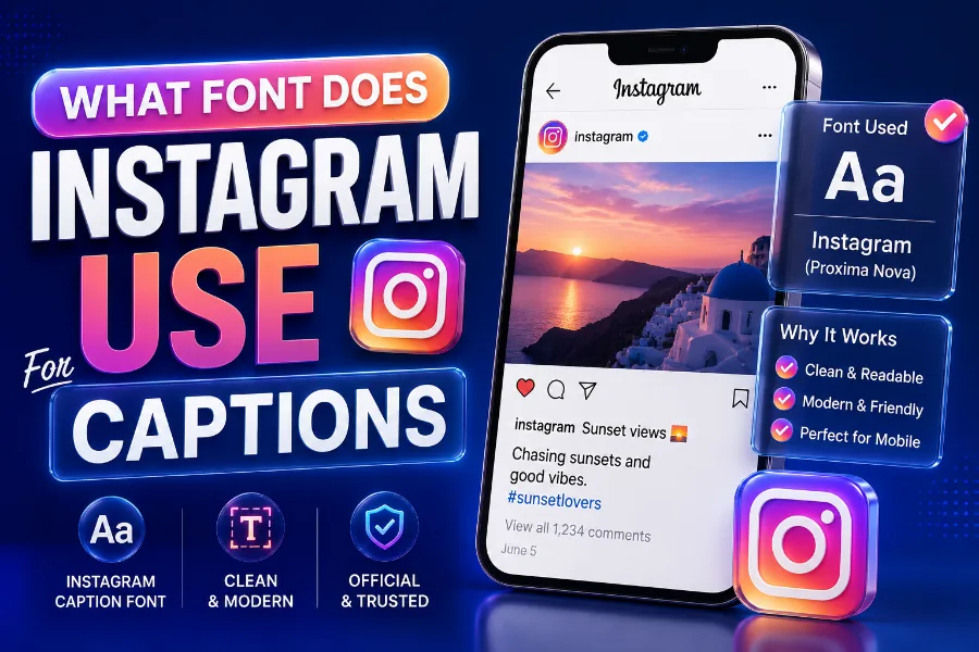
What font does Instagram use for captions is a common question because Instagram text looks simple, clean, and familiar, yet the answer is not as simple as naming one font.
Captions, comments, profile text, Stories, Reels, and brand materials do not always use the same typography system. In most cases, Instagram keeps captions readable by relying on system fonts, while its wider brand identity uses Instagram Sans in selected places.
This guide explains the real difference so you can understand what you are seeing, choose better caption styles, and avoid messy custom text that hurts readability.
What Font Does Instagram Use For Captions?
Instagram captions usually appear in the device’s default system font, which means iPhone users often see a San Francisco or SF Pro-style font, while Android users often see Roboto. That approach makes captions feel native to the device, load quickly, and stay easy to read on small screens.
This is why two people can look at the same Instagram caption and feel that the font looks slightly different. Instagram does not need a single universal caption font when iOS and Android already offer highly readable fonts designed for mobile interfaces.
Instagram’s goal is not to make captions decorative by default. The app wants the photo, Reel, carousel, or Story to stay centered, while the caption supports the content with clear text that doesn’t fight for attention.
If you want stylized text for bios, captions, or creative posts, a font tool can help you test readable styles before publishing, and building fonts for social media, branding, and creative text is useful because it focuses on text styles made for digital platforms. Use those styles carefully, since caption text should still be easy to scan, especially when people are scrolling quickly.
The most accurate answer is that Instagram caption typography depends on context. Captions are mostly system-font driven, while Instagram Sans belongs more to Instagram’s brand identity and selected interface experiences.
Why There Is So Much Confusion About Instagram Fonts
The confusion starts because people use “Instagram font” to describe different things. Some mean the caption font under a post, some mean Story fonts, some mean the Instagram logo, and others mean the stylish text people paste into bios.
Older articles also add to the confusion because Instagram’s design has changed over time. Some pages mention Proxima Nova or Helvetica, while newer sources talk about Instagram Sans, SF Pro, San Francisco, and Roboto.
The reality is that Instagram uses a typographic system rather than a single font everywhere. A modern app needs different font behavior for interface labels, captions, comments, ads, Stories, Reels, and branding.
Device differences also matter. If you use Instagram on an iPhone, the app should feel like it belongs inside Apple’s design environment, and that is why the text can look close to Apple’s system typeface.
On Android, Instagram needs to feel natural inside Google’s design environment. Roboto is familiar to Android users, performs well, and maintains a consistent interface with many other apps on the device.
That is why a clean article should avoid saying “Instagram uses only this font.” A better answer explains where the text appears, which device displays it, and whether it’s part of the interface or Instagram’s brand design.
Instagram Sans Versus Caption Fonts
Instagram Sans is Instagram’s custom brand typeface, designed to make the platform feel more recognizable across products, campaigns, and selected interface areas. It has a friendly, rounded look that fits Instagram’s visual personality without feeling too formal.
However, saying every caption uses Instagram Sans can be misleading. In everyday caption viewing, many users still see text shaped by their device’s system font, especially on iOS and Android.
The better way to understand Instagram Sans is to see it as a brand font, not simply a caption font. It supports Instagram’s identity but does not automatically replace every readable text element across all devices and app surfaces.
Custom font styles are most useful when they match the audience and platform, and a TikTok font generator is designed for creators who want social-style text that feels bold, playful, and hard to miss. That kind of style can inspire Instagram creators, too, but it should be used for short emphasis rather than long captions.
Think of Instagram Sans as part of Instagram’s official voice. Think of system fonts as the practical engine that keeps captions and interface text readable for millions of people on different screens.
That distinction helps you avoid a common mistake. You do not need to hunt for an exact downloadable Instagram caption font if your real goal is to create text that feels clean, mobile-friendly, and easy to read.
Fonts Used In Instagram Stories And Reels
Instagram Stories and Reels are different from feed captions because they give you built-in font styles. These creative text choices are designed for expression, hooks, overlays, reactions, announcements, and short messages that appear directly on visual content.
You may see styles that feel classic, modern, bold, typewriter-like, neon-inspired, or casual. These are not the same as the plain caption font under a regular feed post.
Story and Reel fonts are more expressive because the content format is more visual and temporary. A caption under a post often explains context, while Story text often works like a headline or mood marker.
Some creators also want specific nostalgic or themed looks, and a Papyrus font generator is made for people who want text with an ancient, handmade, or decorative feel. That style can work for themed graphics, but it should be used with restraint because highly decorative letters can become harder to read on mobile screens.
The best Story or Reel font is the one that matches the purpose of the post. Use bolder styles for calls to action, softer styles for personal notes, and simple styles for information people need to understand quickly.
If your text sits on a busy image or video, readability matters more than personality. Add contrast, keep lines short, and avoid placing text over faces, product details, or moving background elements.
Why Instagram Uses System Fonts For Readability
System fonts are built for performance, accessibility, and familiarity. When Instagram uses fonts that already belong to the user’s device environment, the text feels natural and loads smoothly.
This matters because Instagram is a high-speed app. People scroll through images, videos, ads, comments, captions, and messages quickly, so the font must stay legible without slowing the experience.
San Francisco and SF Pro-style fonts are made for Apple devices, while Roboto is deeply associated with Android. Both font systems are designed to handle small text, dense interfaces, and different screen sizes.
Instagram also has a global audience. A font system has to support many languages, symbols, and writing habits without breaking the layout or creating awkward spacing.
Readability is also an accessibility issue. Users with low vision, small screens, bright outdoor lighting, or fast scrolling habits need letters that stay clear without extra effort.
This is why the simplest font often wins. A plain Instagram caption may look ordinary, but that plainness is intentional because the text has to work for millions of users in countless viewing conditions.
Can You Change The Instagram Caption Font?
Instagram does not offer a built-in setting that lets you choose a different feed caption font. When you type a normal caption, the app displays it through its standard text system.
However, you can create the appearance of different fonts by using Unicode-style text generators. These tools convert normal letters into special characters that look bold, cursive, gothic, bubble-like, or decorative.
The important detail is that these are not always true fonts. They are often special Unicode characters, which means they may display differently across devices, screen readers, apps, or older operating systems.
You should use custom caption text sparingly. A few styled words can make a hook or phrase stand out, but an entire caption in decorative text can feel hard to read.
This is especially true for business accounts. If your caption explains pricing, product benefits, event details, medical information, legal information, or instructions, clarity should come before decoration.
A good rule is simple. Use the default caption font for the main message, then use custom styling only for short phrases, section labels, or attention-grabbing words that do not carry the whole meaning.
Best Font Style For Instagram Captions
The best Instagram caption style is clean, readable, and consistent with your content. You do not need fancy typography to make a caption perform well.
Strong captions usually win because of structure, not font tricks. A clear first line, short paragraphs, useful details, and a natural call to action often matter more than decorative letters.
If you write for a personal brand, keep your caption style conversational and easy to follow. Readers should feel like you are speaking to them, not hiding the message behind visual effects.
If you write for a business, use plain text for credibility. Customers want fast answers, and complicated lettering can make a brand look less professional.
If you write for entertainment, fashion, beauty, or lifestyle content, you can use more personality. Even then, the custom font should support the tone rather than take over the caption.
The safest formula is to use normal text for most of the caption and one styled phrase for emphasis. This gives you a branded feel without making the caption look cluttered.
How Instagram Caption Fonts Affect Engagement
Fonts influence engagement because they affect how quickly people understand your message. A caption that feels easy to read has a better chance of holding attention after the visual hook does its job.
Instagram users often decide within seconds whether to keep reading. If your text looks confusing, crowded, or overly decorative, many people will scroll away before they reach your main point.
Clear captions also help comments. When readers understand the message quickly, they are more likely to answer a question, share an opinion, or click through to a profile.
For creators, the first line matters most. It should introduce the value, curiosity, emotion, or problem without needing unusual typography to carry it.
For brands, the caption should reduce friction. Use simple wording, short paragraphs, and a clear next step so the reader knows what to do.
Decorative text can help engagement when it highlights a short phrase. It can hurt engagement when it makes the entire caption feel like work.
Caption Font Tips For Brands And Creators
If you want your Instagram captions to look professional, start by choosing a consistent writing structure. Font appearance matters, but consistency matters more across repeated posts.
Use normal caption text for the body because it keeps your account readable. Then use spacing, emojis, and limited styled text to guide the eye.
Do not overuse bold-looking Unicode characters. They may look exciting in one post, but they can make a whole profile feel noisy when used in every caption.
A brand should also consider accessibility. Some decorative characters may not be read properly by screen readers, which can create a poor experience for users who rely on assistive technology.
For product posts, use clear section labels such as benefits, features, price, or availability. You can style a label, but keep the explanation plain.
For creator posts, use a strong hook and natural rhythm. A caption with a human voice usually performs better than one filled with hard-to-read symbols.
Common Myths About Instagram Caption Fonts
One common myth is that Instagram uses the same font everywhere. That is not true because captions, Stories, Reels, logo design, and brand assets can involve different typography choices.
Another myth is that Instagram Sans is available for everyone to download and use freely. In reality, Instagram’s official brand typeface is not something you should assume is publicly licensed for general design projects.
Some users also believe font generators install new fonts inside Instagram. They usually do not, because most of them create stylized Unicode characters that Instagram can display as text.
Another myth is that fancy caption fonts always increase engagement. They can catch the eye, but they can also reduce readability and make your message feel less trustworthy.
People also confuse the Instagram logo with caption text. Logo lettering is part of brand identity, while caption text is functional interface content.
Once you separate these categories, the answer becomes much clearer. Instagram uses different typography choices for different jobs, and each job has its own purpose.
Better Alternatives To Copying Instagram’s Exact Font
Instead of trying to copy Instagram’s exact caption font, focus on creating text that feels native to the platform. That means readable, short, clean, and visually balanced.
For designs outside Instagram, you can use fonts that create a similar modern feeling. Roboto, Inter, Helvetica, SF Pro-style fonts, and Poppins can all create a clean social-media look.
If you are creating graphics in Canva, Photoshop, Figma, or another design tool, match the font to the content. A product announcement needs clarity, while a mood board can handle more personality.
For captions inside Instagram, focus on formatting. Use line breaks, short sentences, and a strong opening line to make the default font work harder.
If you want branded consistency, create a caption system. For example, use one opening style, one structure for tips, and one ending style for calls to action.
This approach works better than chasing a hidden font name. The reader cares less about the exact typeface and more about whether your caption is useful, clear, and worth finishing.
Mistakes To Avoid With Instagram Caption Fonts
The biggest mistake is using decorative text for a full caption. It may look unique at first, but it often becomes hard to read and can reduce trust.
Another mistake is mixing too many styles in one caption. When every phrase looks different, readers do not know where to focus.
You should also avoid using custom characters for important information. Dates, prices, phone numbers, discount codes, and instructions should stay in plain text so readers can copy and understand them easily.
Do not sacrifice accessibility for style. If your account serves customers, students, patients, clients, or a wide public audience, your captions should work for as many people as possible.
Avoid writing long blocks of text without spacing. Even with a clean default font, dense paragraphs can feel tiring on a phone screen.
Finally, do not assume a caption looks the same for every user. Always remember that device type, app version, and operating system can influence how text appears.
Final Answer For Instagram Caption Fonts
The final answer is practical rather than mysterious. Instagram captions generally use device-based system fonts for everyday readability, while Instagram Sans supports the platform’s broader brand identity.
On iPhones, caption text commonly appears close to Apple’s San Francisco or SF Pro design language. On Android, it commonly appears close to Roboto, which is familiar across many Android interfaces.
Stories and Reels are separate because they include creative text styles for visual expression. These fonts help creators add mood, emphasis, and personality directly on images and videos.
Custom caption fonts are possible through text generators, but they should be used with care. They are usually Unicode-style characters, not true Instagram font settings.
If your goal is better captions, focus first on clarity. A strong caption in a simple font will usually beat a weak caption in a fancy style.
If your goal is stronger branding, use custom text only where it adds meaning. The best Instagram typography feels intentional, readable, and aligned with the content people came to see.
Conclusion
what font does Instagram use for captions is best answered by looking at the device, the text location, and the purpose of the typography. Instagram captions usually rely on system fonts such as San Francisco or SF Pro-style fonts on iOS and Roboto on Android, while Instagram Sans plays a bigger role in brand identity and selected interface areas.
Stories and Reels use separate creative styles because those formats need personality and visual emphasis. If you want better captions, do not chase decorative text first. Write a strong hook, keep your message readable, and use custom styling only for short emphasis. The font should support your content, not distract from it.