What font does the military use is a common question because people often confuse official military writing with rugged stencil lettering seen on crates, uniforms, games, posters, and patriotic designs.
In reality, the answer depends on whether you mean formal Army correspondence, training documents, presentations, vehicle markings, or military-inspired branding. This guide explains the practical difference, helps you choose the right font for the right purpose, and shows why readability matters more than decoration when the writing is official.
What Font Does The Military Use For Official Documents?
For official Army-style writing, the safest answer is Arial, usually in 12-point size, because formal correspondence needs to be clear, readable, and easy to process across offices, printers, and digital systems.
That may feel plain if you expected a stencil font, but official writing is not supposed to look like a movie poster, and a tool such as build fonts for social media, branding, and creative text fits creative projects better than military memos, policy letters, or professional correspondence. When your goal is credibility, choose a clean sans serif font, keep the layout consistent, avoid decorative effects, and remember that the best official font is usually the one readers notice the least.
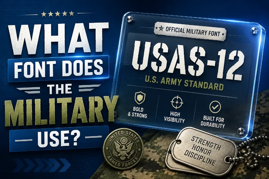
Why Military Fonts Look Different In Design
Military-style fonts in design usually look bold, square, distressed, condensed, all-caps, or stencil-based because they are built to create a visual feeling of strength, discipline, command, and durability.
These fonts are common in logos, posters, apparel, patches, tactical brands, gaming graphics, book covers, and event designs because they communicate identity before the reader studies the words. They are useful when you want a design to feel rugged or mission-focused, but they are not automatically suitable for official letters, resumes, reports, or documents that require a professional tone.
Official Font Vs Military-Style Font
The biggest mistake is assuming the font used on an ammo crate is the same font used in military writing, because those two jobs are completely different. Official writing needs a predictable structure, while visual branding can use dramatic lettering, and a creative page such as papyrus font generator shows how a specific font style can change the mood of text without making it right for formal documents.
Use Arial or another clean sans serif for serious communication, then use stencil, block, grunge, or tactical display fonts only when the project is visual, themed, and clearly non-official.
Why Arial Works Better Than Decorative Fonts
Arial works because it is familiar, simple, widely available, and readable at normal document sizes, which matters when readers need to scan orders, instructions, forms, and memos quickly.
Decorative fonts can be powerful in the right setting, and a tool like curved font generator can help shape text for logos or social graphics, but curved or stylized lettering can slow readers down in formal writing. When you write for a military audience, a government-style audience, or a professional reader, the font should support the message rather than compete with it.
Where Stencil Fonts Actually Belong
Stencil fonts belong in places where the visual reference makes sense, such as military-themed branding, survival gear packaging, veteran events, airsoft team graphics, unit-style merchandise, or patriotic posters. They work because stencil lettering has a practical history: it suggests markings painted onto crates, vehicles, equipment, and storage containers where fast recognition matters. However, the same broken letter shapes that make stencil fonts memorable can reduce readability in long paragraphs, so you should reserve them for short words, titles, badges, labels, and high-impact display text.
Best Font Choices For Military-Inspired Projects
For military-inspired creative work, start with the purpose of the project before choosing the font, because a veteran nonprofit, a tactical fitness brand, and a war-game logo should not all look the same.
A bold stencil font can feel tough, a condensed sans serif can feel disciplined, a slab serif can feel historical, and a distressed display font can feel weathered or combat-worn. Your best choice is the font that matches the emotional message while staying legible at the size where people will actually see it.
Fonts To Avoid In Serious Military Writing
Avoid script fonts, novelty fonts, overly distressed fonts, cartoon fonts, and highly decorative lettering when you are preparing serious military-style writing. These fonts may look interesting at first, but they can create a casual or unprofessional impression, especially when the document involves instructions, policy, leadership communication, or official records.
You should also avoid using all caps for long passages because it reduces reading comfort and makes the page feel like it is shouting at the reader.
How To Choose A Military Font For Logos
When choosing a military font for a logo, test the font in small sizes, large sizes, black and white, and on the exact background where it will appear. Many rugged fonts look impressive in a preview but lose clarity on patches, embroidery, mobile screens, or printed labels, especially when the letters have rough edges or narrow gaps.
A strong military logo font should be memorable, but it should also survive real-world use without turning into a heavy block of unreadable shapes.
How To Use Military Fonts On Posters And Shirts
Posters and shirts give you more freedom because the font can carry emotion, attitude, and visual energy in a way that official writing cannot. For shirts, use short phrases, strong contrast, and simple layouts because people usually read apparel while moving, not while studying every detail.
For posters, pair one bold military-style headline font with a cleaner body font so the design feels powerful without becoming noisy or hard to read.
Military Fonts For Presentations And Briefings
Presentations need balance because they are visual, but they still have to communicate quickly to people in a room or on a screen. Use a clean font for most slide text, then consider a military-style font only for the title slide, section breaks, or visual theme elements.
If every bullet point uses a rugged stencil font, the presentation may look themed, but it will also become harder to read and less professional.
Licensing Matters Before You Use A Font
Before using any military-style font in a logo, product, shirt, YouTube channel, app, or client project, check whether the font license allows commercial use.
Many free font sites include fonts that are free for personal use only, which means they may not be safe for paid branding, merchandise, or business materials. A font can look perfect and still be the wrong choice if the license does not match how you plan to use it.
Final Answer For Everyday Use
If you are writing an official-style document, use Arial 12-point or a similarly clean, readable sans serif font, because that choice fits the professional purpose better than any rugged display font.
If you are designing military-themed visuals, choose a stencil, block, slab serif, condensed, grunge, or tactical display font depending on the mood you want to create. The simplest rule is this: official writing needs clarity, while creative military design can use personality as long as readability and licensing stay under control.
Conclusion
What font does the military use depends on the setting, but for official writing, Arial in a standard readable size is the practical answer you can trust. Military-style fonts are different because they are design tools, not universal document standards, and they work best in logos, posters, apparel, games, packaging, and themed visuals. If you want a professional document, keep the font clean and quiet; if you want a bold design, use stencil or rugged lettering with purpose, restraint, and proper licensing.